
Have you ever walked into a room and been instantly drawn in by the color palette there, feeling that the entire space is both harmonious and vibrant? This is actually no coincidence, but thanks to the classic 60-30-10 rule. Today, we’re going to show you how to apply this rule to create a living environment that is both cozy and upscale!
What is the 60-30-10 rule?
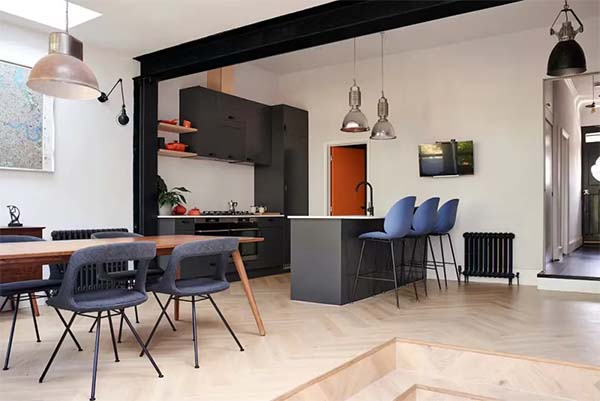
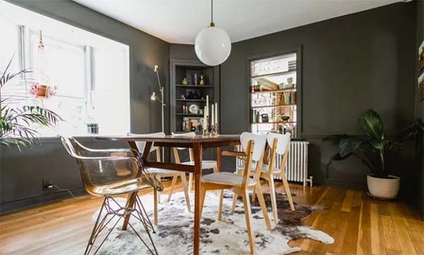
The 60-30-10 rule is a very practical color distribution ratio that is widely used in interior design and fashion coordination. The core of it is: to divide the colors in the space into primary, secondary and accent colors, and then distribute them according to the ratio of 60%, 30% and 10%.
● 60% Primary color: This is the most dominant color in the space, usually used on walls, floors or large furniture, determining the overall style of the room.
● 30% Secondary Color: This is the second most important color and can be used on furniture, curtains or decorations to add some variation and contrast to the main color.
● 10% Emphasis Color: This is the most eye-catching color and is typically used on small decorative pieces or accents to add a bit of energy and personality to the space.
This proportional distribution can make the space look more layered and more harmonious and advanced.
Why is color proportion so important?
Color is a big deal in home design, it not only affects the aesthetics of the space, but also changes the atmosphere and feel of the room. Many people think that as long as you choose a few favorite colors just to ride on it, but in fact, the color ratio is not right, the space will look messy.
The 60-30-10 rule is here to solve this problem. It uses the scientific proportion of the distribution, so that the color of the space has a sense of hierarchy but also harmony and unity. Below, we’ll talk more about this rule and show you how to use it in your home design.
How to apply the 60-30-10 rule?
Step 1: Pick three shades
Start by picking three shades for the room. You can start with your favorite colors or decide based on the function of the room and how you want it to feel. For example:
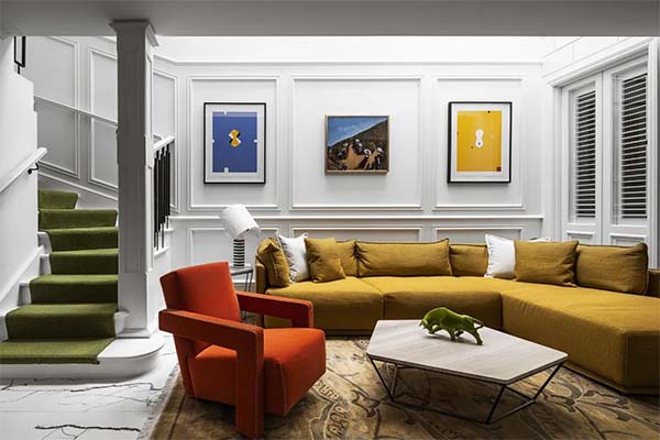
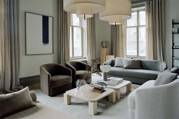
● The living room can pick a warm neutral color (like beige or light gray) as the main color, with a touch of soft blue or green as the secondary color, and then gold or orange for accents.
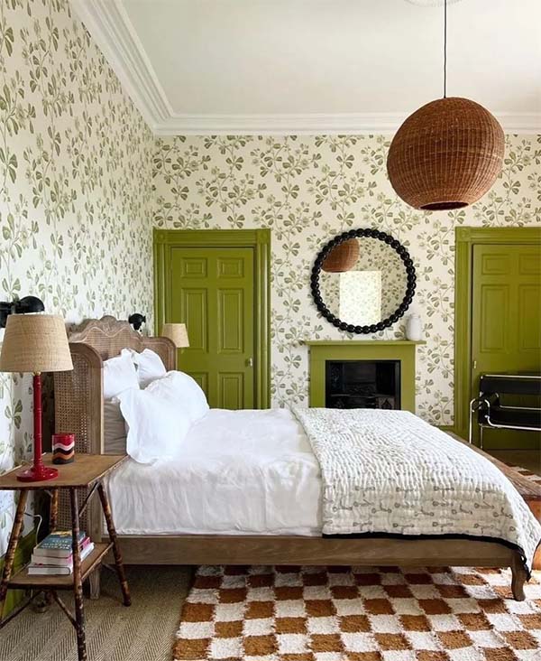
● Bedroom can choose soft pink or light purple as the main color, with a little white or gray as the auxiliary color, and then use dark blue or dark green as accents.
Step 2: Distribute colors proportionally
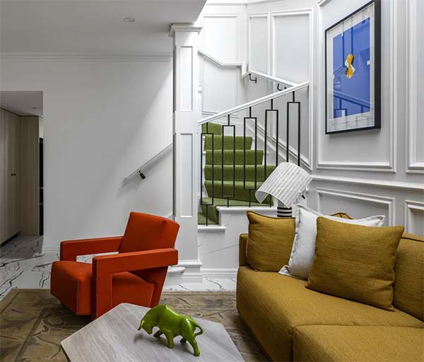
● 60% Primary Color: Use the primary color on walls, floors or large furniture. For example, pick a classic white or light gray paint from Diamond Paint USA and paint the entire wall to set the tone of the room.
● 30% Secondary Color: Use the secondary color on sofas, curtains or rugs. For example, pick a dark blue or dark green sofa to contrast with the main color.
● 10% Accent Colors: Use accent colors in pillows, paintings, or small ornaments. For example, choose a bright yellow pillow or metallic decorations to add some brightness to the space.
Step 3: Adjust the ratio flexibly
While 60-30-10 is a classic ratio, you can also adjust it appropriately depending on the size of the room and the light situation. For example, in a small room, you can use less of the main color and more of the secondary color so that the space won’t look too depressing.
Now, come on and try the 60-30-10 rule! Breathe new life into your home! Remember this rule to make your home design better! The 60-30-10 rule makes your home more harmonious and advanced! Don’t forget to utilize this rule flexibly in practice! 60-30-10 rule, a powerful assistant for home design! Come and try it together!